Regarding my ideas, I started with looking at school uniforms for kids. I considered boy and girl uniforms, with the short sleeve and tie combination looking the best in my opinion.

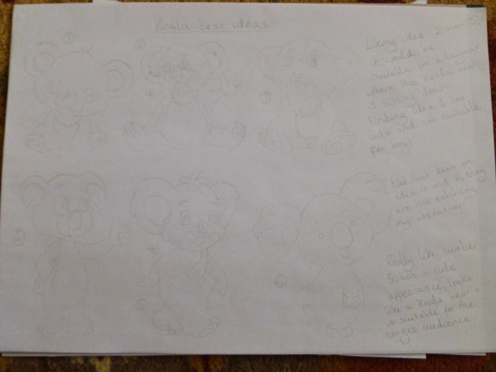
Next, I moved onto designing a koala bear. The middle ones were my favourite as they looked fun, adorable characters that will suit the target audience. I was looking forward to developing them!
After this, I thought about the font. I wanted to use a font that links with the cheeky character of the koala bear, along with being sans serif.

Having selected the uniform, the koala bears and the font, I placed them together to make some poster designs. The fourth idea is my favourite as you will be able to see what the cereal looks like and the koala bear appears very happy to see the cereal. I would be developing this idea with various colours.


With my favourite design chosen, I moved onto adding colour. Out of the six choices, I preferred the yellow one as it is distinctive and suits the target audience.


Satisfied with the yellow, I moved onto thinking of colours for the tie, as black appeared boring and dull. I was impressed with the green/yellow combination as this links with the colours of the Australian football and rugby clothing.

Next, I moved onto the colour of the font, as the white is too plain. Out of these colours, the light blue and red are too bright against an already bright background. The dark blue and brown are the better choices as the readability is better. As the cereal is called 'Koko Koala', I decided on using the brown to link with the chocolate theme.

This is my final design for Koko Koala. Overall, I am very happy with this as the colours are eye-catching, suits the target audience and I feel this design can work as the front cover of a cereal box.

So far, I am finding my visualisation skills improving. Along with getting positive feedback from my tutors, I am feeling positive for the next brief!
Mike
No comments:
Post a Comment