A major ethical concern with this brand is that Nestle tried to run a similar campaign and faced a lot of negative publicity. Also, these young mothers might not have enough money to continue paying for the formula after the free sample and they may not have clean, warm water to mix the supplement. If the supplement is stopped and/or mixed with dirty water, the baby is not going to get the nutrients required and could die because of this. Over the week when I was completing my ideas, I felt uneasy about the purpose of this company as I would not like to be part of a brand that is responsible for young deaths in South Africa. If I was forced to design a social media campaign for this, I would make sure it was advertised truthfully and the consumers are fully aware of the implications/requirements of the product.
Regarding my designs, I started off by choosing a font. I wanted a sans-serif font that looked clean and modern. This should appeal to the consumers.

Next, I thought about app logo ideas. I thought the 'MM' would stand out well on the logo and having 'formula' underneath would inform the viewer of who this brand is. Idea 4 was my favourite and I wanted to develop this further.

Following from sorting out the logo, I moved onto thinking about how the viewers will get from one page to another. I considered placing buttons on the pages but I prefer the idea of using your finger to swipe from one page to another (similar to using an iPad/iPhone) as it is modern and showing the brand is up-to-date with technology.

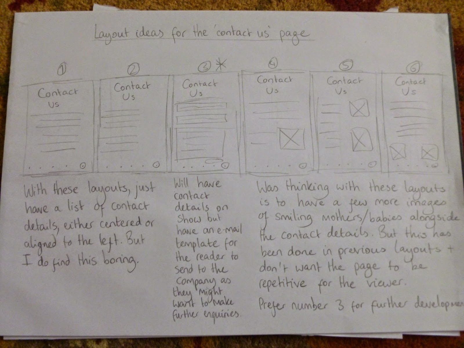
After completing this, I considered the layouts for all the pages. I wanted each page to be different and at the same time, present the information in a clear and concise manner.


With the layouts organised, I tried out various colours for the app logo and homepage. I aimed to use pastel colours as this would imply a softer approach to the viewer and would suit the target audience. In the end, I chose the bottom middle colour and it is not gender specific and the text is readable.


With my preferred colour chosen, I placed this on the rest of the pages. I feel this colour suits all the pages and sets the right tone about the main subject (the baby supplement).

With all aspects of the layouts and app logo completed, I placed these designs on mobile devices. Overall, I think the app logo fits in perfectly with the other apps and does not appear out of place. As for the pages, the layout is clear and the pages look readable. These layouts should be easy to understand on a mobile device.


These past three weeks have been intense but my visualisation skills have improved. When I undertake more briefs in the future, I will aim to maintain this level of generating ideas.
Mike
No comments:
Post a Comment