Sunday 9 November 2014

Group Critique for Baby Supplement Brief

Following from completing the baby supplement brief, our tutor asked us to note down our analysis of everyone's work. Below are the 4 points we used to consider when discussing their work:
1. Language
2. Colour
3. Image
4. Nutritional message/positive message

Alex
1. The language is informative.
2. The colours are bright, but it would be good to try out different variations.
3. I did feel the imagery was a bit stereotypical, but the people do look happy.
4. The message is clear to the viewer and is well informed.

Chloe
1. The language is readable.
2. A good variety of colours. There is a bit of white space on show too which I think is very important.
3. Nice choice of images, the mum and baby appear happy.
4. There is an emphasis on the product being 'free', but not so clear on the message that is being outlined.

Shannon
(She designed an alternative healthy product to the brief due to ethical grounds).
1. The language is clear.
2. The colours are bright and link with the chosen fruit. They will stand out in a supermarket.
3. The images link with the product advertised and I like how it is in the shape of the fruit advertised.
4. We are not sure if it is free.

Kerri
1. The language is informative, yet straight to the point.
2. It is nice to see a few more varied colours, but the chosen ones suit the subject matter.
3. Images link well with the subject.
4. The message is clear and viewers will know who it is for.

Chris
1. Language is clear and is not too much in the way.
2. Colours link with South Africa and there is a good variety.
3. The South Africa flag is on show but a bit too predictable?
4. The message is on the packaging, but not all of it is noticeable straight away. I am also unsure if it is free too.

Antony
1. I am unclear on what is being said.
2. It would be nice to see more variety.
3. I appreciate how he is thinking outside the box, I like that.
4. He has covered all the basics needed for a first time mum.

Jason
1. There is little information on show.
2. No colour.
3. The images link with the subject but it would need more clarification. 
4. Message is unclear so I cannot tell what is being advertised.

Thayf 
1. The language is informative.
2. Colours are not too heavy, but the designs would need a colour that is eye catching.
3. Images are a good choice but it would be nice to see black and white babies together, so there are no race issues.
4. There are good buzzwords and are outlined.

Ricky
1. It is great to see he has used both languages (English and South African). He has thought of everything.
2. They are simple, clean, modern and there is not too much colour on show so confusion is little.
3. Images of babies are there.
4. The nutritional message looks to be evident. 

Mike  

Visualisation assignment: Baby Feeding Supplement

The final one week brief that had be completed was to design a social media campaign for a new baby supplement. This would be aimed for infants aged between three months and one year and each sachet would be mixed with 20ml of warm water to provide all the nutrients required for the important early months. The target audience would be young mothers in South Africa (who will get a free two weeks supply over a period of six months), with the aim of providing the benefits of using MM formula.

A major ethical concern with this brand is that Nestle tried to run a similar campaign and faced a lot of negative publicity. Also, these young mothers might not have enough money to continue paying for the formula after the free sample and they may not have clean, warm water to mix the supplement. If the supplement is stopped and/or mixed with dirty water, the baby is not going to get the nutrients required and could die because of this. Over the week when I was completing my ideas, I felt uneasy about the purpose of this company as I would not like to be part of a brand that is responsible for young deaths in South Africa. If I was forced to design a social media campaign for this, I would make sure it was advertised truthfully and the consumers are fully aware of the implications/requirements of the product. 

Regarding my designs, I started off by choosing a font. I wanted a sans-serif font that looked clean and modern. This should appeal to the consumers. 


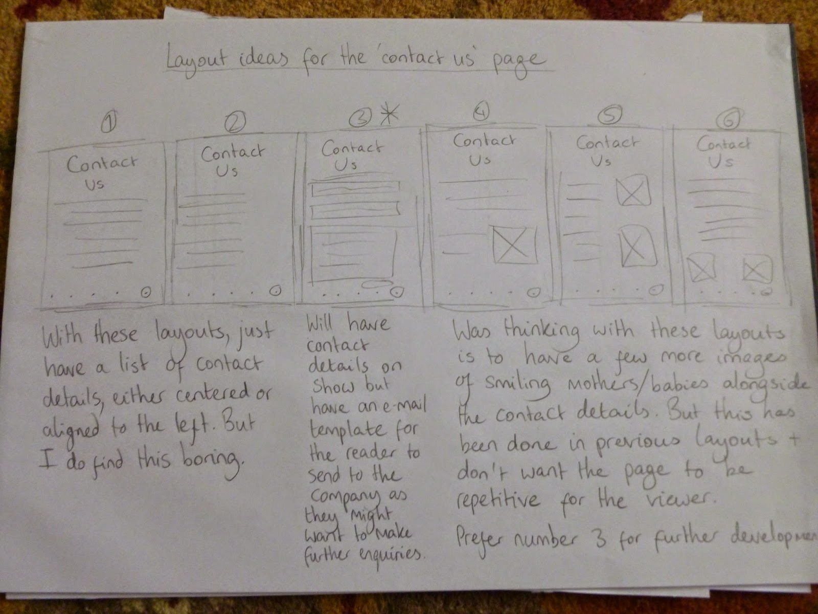
Next, I thought about app logo ideas. I thought the 'MM' would stand out well on the logo and having 'formula' underneath would inform the viewer of who this brand is. Idea 4 was my favourite and I wanted to develop this further.


Following from sorting out the logo, I moved onto thinking about how the viewers will get from one page to another. I considered placing buttons on the pages but I prefer the idea of using your finger to swipe from one page to another (similar to using an iPad/iPhone) as it is modern and showing the brand is up-to-date with technology. 


After completing this, I considered the layouts for all the pages. I wanted each page to be different and at the same time, present the information in a clear and concise manner. 


With the layouts organised, I tried out various colours for the app logo and homepage. I aimed to use pastel colours as this would imply a softer approach to the viewer and would suit the target audience. In the end, I chose the bottom middle colour and it is not gender specific and the text is readable. 


With my preferred colour chosen, I placed this on the rest of the pages. I feel this colour suits all the pages and sets the right tone about the main subject (the baby supplement).


With all aspects of the layouts and app logo completed, I placed these designs on mobile devices. Overall, I think the app logo fits in perfectly with the other apps and does not appear out of place. As for the pages, the layout is clear and the pages look readable. These layouts should be easy to understand on a mobile device.


These past three weeks have been intense but my visualisation skills have improved. When I undertake more briefs in the future, I will aim to maintain this level of generating ideas.

Mike

Visualisation assignment: Koko Koala

The next brief I had to complete was to design a poster for a new breakfast cereal aimed at kids, which would be advertised at a bus stop. The character had to be a koala bear or Australian marsupial/bird, must be anthropomorphic wearing a school uniform, have bags of cheeky character and should appeal to an age group of up to 12 years. A significant area that would question my ethical standards is that the cereal is full of sugar and not healthy for children. Personally, I do not mind completing work for this company as it is up to the parents to decide what their child eats. The designer is not forcing the consumers, just merely suggesting to buy this product. 

Regarding my ideas, I started with looking at school uniforms for kids. I considered boy and girl uniforms, with the short sleeve and tie combination looking the best in my opinion. 


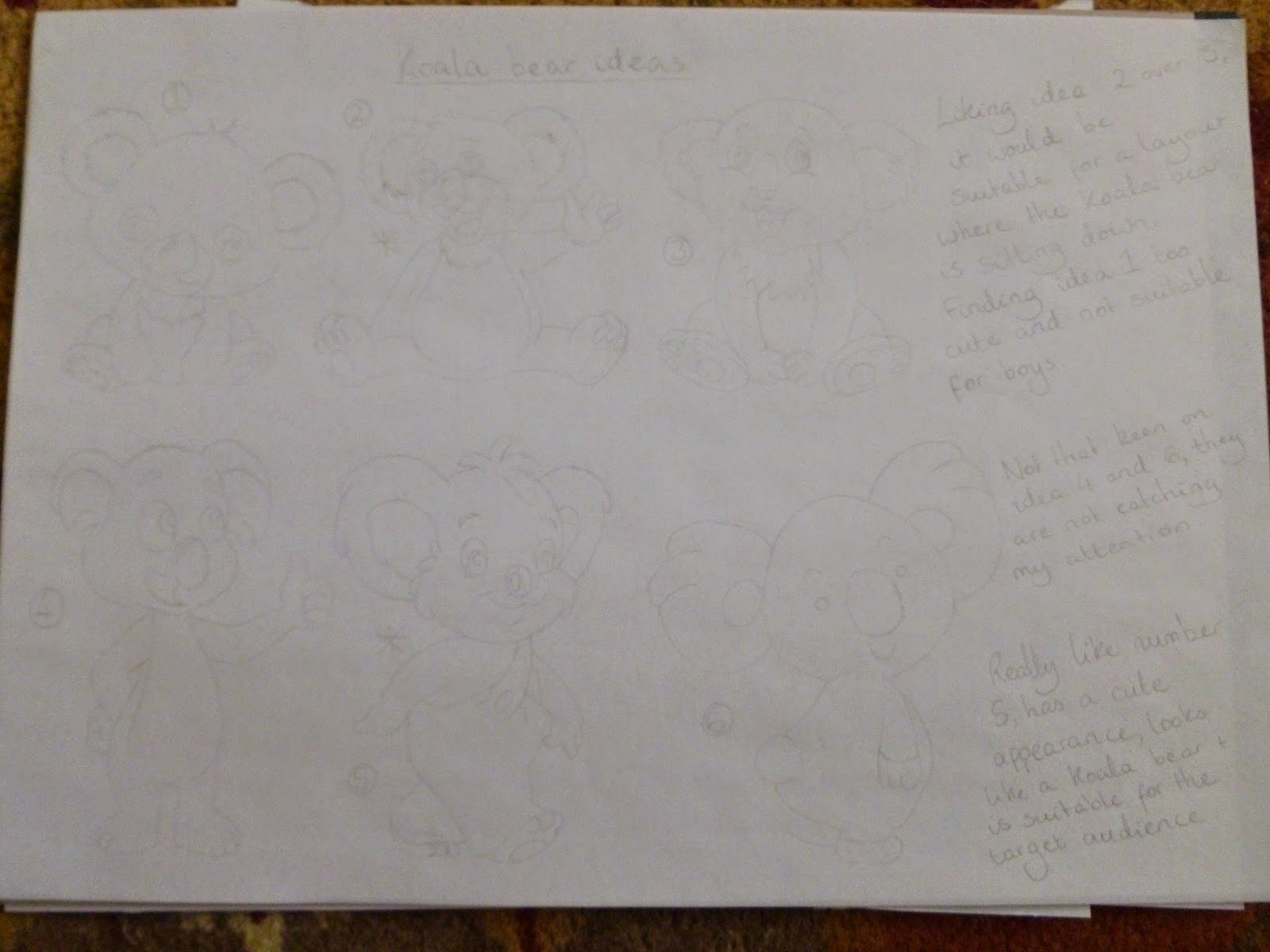
Next, I moved onto designing a koala bear. The middle ones were my favourite as they looked fun, adorable characters that will suit the target audience. I was looking forward to developing them!


After this, I thought about the font. I wanted to use a font that links with the cheeky character of the koala bear, along with being sans serif. 


Having selected the uniform, the koala bears and the font, I placed them together to make some poster designs. The fourth idea is my favourite as you will be able to see what the cereal looks like and the koala bear appears very happy to see the cereal. I would be developing this idea with various colours.


With my favourite design chosen, I moved onto adding colour. Out of the six choices, I preferred the yellow one as it is distinctive and suits the target audience. 


Satisfied with the yellow, I moved onto thinking of colours for the tie, as black appeared boring and dull. I was impressed with the green/yellow combination as this links with the colours of the Australian football and rugby clothing. 


Next, I moved onto the colour of the font, as the white is too plain. Out of these colours, the light blue and red are too bright against an already bright background. The dark blue and brown are the better choices as the readability is better. As the cereal is called 'Koko Koala', I decided on using the brown to link with the chocolate theme.


This is my final design for Koko Koala. Overall, I am very happy with this as the colours are eye-catching,  suits the target audience and I feel this design can work as the front cover of a cereal box. 


So far, I am finding my visualisation skills improving. Along with getting positive feedback from my tutors, I am feeling positive for the next brief!

Mike

Visualisation assignment: Help for Heroes Commemorative Medal

For the first three weeks in the second year of university, we were working towards improving our idea generation skills, the way we communicate ideas and how we visualise our designs. At the same time, the briefs we had made us think about our ethical standards as they did confront our principles and questioned if we could work for a client whose products/services we do not agree with. 

For the first brief, I was required to design a collectors medal for Help the Heroes, along with a presentation case and a leaflet detailing where the British military are active. Also, I had to make sure “Ego auxiliatus Heros” [I helped a Hero] was on the back of the medal, along with the soldiers name and service number. The only thing I felt unsure about was that the metal obtained to craft the medal would be used from the battle kit of the servicemen and women killed or wounded in action. I am not 100% fine using metal from dead soldiers battle kits but I would not reject work to do this as the soldiers know the risks when they are fighting the enemy. If it was metal used from the 9/11 tragedy for example, then I would not work for that client as the victims were innocent people involved in a horrible situation. That would be disrespectful in my opinion.

As for my ideas generation, I started with drawing some designs for the medal. I liked the idea of a soldier saluting on the front and a laurel wreath going around to represent recognition for the soldiers. For the rear, I preferred the quote to circulate around the top half of the medal with the service number and name of the soldier below. 


Next, I thought about the ribbon to attach on the medal. I considered military ribbons like the Victoria Cross but in the end I thought the British flag would be suitable for the product. 


After this, I moved onto creating a presentation case for the medal. I liked the idea of the case being used to display the medal along with keeping the product safe.


With the medal designs completed, I considered the layout of the leaflet. In the end, I thought about having both spreads showing the Western and Eastern countries, with arrows detailing the places the military are based at. 


Following from completing my designs, I added colour to my best ideas. The design of the medal looks great as it is simple, nothing is too close or clashing and the design is a fitting tribute to the men and women of the military. 


Having included colour to the ribbon, this will be a stand out feature that adds vibrancy to the overall package. The flag will also be presented horizontally as the flag works best this way.


Next, I added colour to the outside box. I tried black and brown out but I preferred the black as the box appeared classier in this colour and felt it would suit the medal. 


I also considered the colour of the text on the medal box. I tried silver and gold but thought the silver links well with the colour of the medal and was better readability wise. Alongside this, I designed a net for the box. I am confident it would fit together.


Satisfied with the packaging and design of the medal, I added colour to the leaflet. The background will be light blue to represent the sea with the green being the countries. I think this design is interesting, with the layout different compared to three column grid layouts.


These are my final design ideas for the medal. The colours are balanced well against each other, the images can be seen clearly and the black case appears very professional with the medal and flag inside. I am very happy with these!


It has been an intense week completing these designs but it has been good to get a feeling of what it would be like to work in a graphic design studio. I am interested to see how the next two briefs go...

Mike