Wednesday 22 January 2014

New project research

I am currently starting a new 4 week project which is all about infographics. The final result will involve presenting data I have collected using a questionnaire that is visually exciting. However, before I start drawing ideas, I did some research into 3 infographics that I found interesting and think I can relate back to for inspiration. 

The first one is an interactive infographic about aviation by The Guardian. Below are screenshots I have taken showing the interactive features. 


I was very impressed with this infographic as the animations were unique for me and helped keep my attention. It definitely allows the viewer to interact with the piece. The text was also in bite-size chunks which made it easier to take in all the information that was being produced. I also appreciated how the infographic used different shades of blue which I thought gave this feature consistency throughout, and links with The Guardian house style colours. Overall, this successful piece of communication is highly inspiring as it gives me ideas in creating a fun, interactive infographic that is not static and not boring for the viewer. 

The next infographic I have analysed is about how the American state Austin 'sucks'. For the record, I did not choose this infographic because of the subject but instead the graphical features that caught my attention.   


What instantly grabbed my attention with this infographic was the colours. Consistently using blue, orange and red throughout keeps a theme going and is an eye-catching design. Also, despite being majorly full with text, I did not find this off-putting. Separating the text into invisible boxes appears more appealing for the viewer and not discouraging. Overall, this has been a really interesting infographic to admire at as the designer has succeeded in implementing the text well into a design that is modern, clean and engaging to look at. This gives me ideas in completing sketches that highlights a text-based design, with various fonts and colours. 

The final infographic I have analysed is one discussing the colours of the web.


I found this infographic very interesting in terms of subject matter as it made me realise how important colour is for a logo. I admire how the designer has used colour palettes (similar looking to pie charts) to discuss how the top 100 web brands are similar in terms of colour. However, what did grab my attention was how the designer indicated the similarity of these brands by using the same colours (especially in the social network category). I think this style will suit the questions my group suggested for the questionnaire as I could possibly find a correlation within the results. The designer has been successful in pointing out the similarities within these popular brands, something I will try to attempt with my answers.   

In conclusion, my ideas have been flowing now that I have got some research done! These infographics have been highly influential for me in improving my knowledge of them and give me the enthusiasm to create a unique infographic that displays my results in a visually effective way. Very exciting times ahead!

Mike  

References:

Monday 13 January 2014

Update on my drawings

After viewing my peers work, I decided to include some colour to give people a better impression of what my pages could look like. I am glad I did this as it builds my confidence in continuing to develop these ideas. Below are my drawings today:


Finished this project for now and will be starting a new one next week, very exciting times ahead!


Mike

Sunday 12 January 2014

Going underground!

For this current brief, I now had to design wire frames for a web based version of my life story. I managed to establish a visual style that I wanted to use in as many pages as possible... the London Underground tube map. I chose this because my life is like a train journey - there are many stops on the way but I manage to reach my destination (attending university). The images below are the influences that have helped me in my designs:

London Underground logo
London Underground tube map (2013)
London Underground tube map (1908) 
Hans Unger - Art Today (1966)
Fly the Tube to New York (2001)
It is from these I started creating my wire frames. Below are my best ones:


The first three images show my favourite wire frames for the homepage and the introduction pages for each chapter of my life. The other three images are a few stories I will be including. I have aimed to make my webpages appear as a fun, interactive experience for the viewers, whilst having the spirit of the London Underground.  

Overall, I have enjoyed completing this brief and would love to have the opportunity to make an actual app about my life story in the near future!

Mike 

Image sources:


Sunday 5 January 2014

Going back in time!

Alongside working on the current brief (my life story), we had to complete another brief over the Winter break. Being given a specific decade (mine being 1930-1939), we had to research anything art related in that time along with significant social/political/cultural events that took place. 

I was a bit skeptical at first if I could find any information, but after doing my research I was struggling to fit it all on the page! I was also impressed by some of the various artwork that was done in that decade, with some art pieces I recognised. Completing this brief has made me more aware of art history and has been interesting to do as well.

Below is my timeline, I'm looking forward to printing it on A3 now! 


Mike   

My influences for this project

A belated Happy New Year to anyone reading this!

I decided it would be a great idea to show what has been influential so far in developing my ideas.


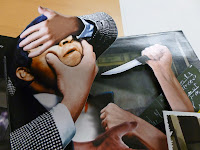
The first book is called Alfred Hitchcock: The Master of Suspense: A Pop-Up Book. I loved analysing this book as the pop-ups were amazing to look at and inspired me to be creative with my pages. Below are a few examples of the pages:


The second book is Hot Jazz Special. Despite the lack of pop-ups, I was still enthralled reading the book as the visuals are superb and capture the passion and spirit of jazz music. 


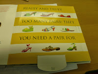
The final book I analysed was Shoe Love: In Pop-Up. I was surprised in a good way by the pop-up features as they were different to other ones and the author adapted the shoes very well into a visual that would gain the reader's attention. The book has also made me think about how to combine my stories and pop-ups together that link well, instead of just putting pop-ups in for the sake of it.  


Overall, I found these books to be very beneficial to my development and I will be posting more influences later next week. Back at uni tomorrow so I am interested to see how I will be taking my prototypes further. 

Mike