Saturday 24 January 2015

iHuman digital brief

The next brief that I undertook at university involved the exploration of digital communication and web design. The aim was to discover what makes us human and present as a set group the qualities of human life via a website.  

To start, I did a mind map with my colleagues on what areas we could do. For me, I decided to choose 'intelligence' as I was confident I could address this topic in a positive way.  


From that, I moved onto defining what is intelligence, along with researching a range of intelligent people I could include on my webpage. 


With my theme chosen, I moved onto thinking of ideas for the homepage and my webpage. To start, I drew a range of fonts that could be used on these. For the homepage, I was thinking of using Futura Medium and for my page I was liking Agency FB. 


Next, I moved onto designing some ideas for the homepage. The first three ideas where completed by the set group whilst ideas 4 - 6 where thought of by myself. I preferred idea 5 as the homepage would appear organised, along with not requiring much clicking as you would only have to hover the mouse over the four main subjects to see the themes.  


From that, I moved onto trying some colours. I tried out a few to see how they would look, with promising results. 


I have also provided evidence of the inspiration I had to design my idea for the homepage. 

Following from a meeting with the group about the homepage, we agreed on adapting a space theme (this linked with the brief which was to persuade aliens not to terminate Earth). 


For inspiration, I had a look at my friend's website who used a space theme. My annotation is available to see in the image. 


I tried out a few ideas with a space theme for the homepage. Analysing these, I found them to be a bit complicated for the viewer's. This did mean having a re-think about the layout. 


Again, looking for inspiration, I came across this webpage. My annotation is available to see in the image.


Adopting this technique, I tried the circles out. I thought this idea would have a lot potential for the homepage, however this was the furthest I got with developing the homepage. Two other colleagues in my group created the final homepage. 

With my involvement in creating the homepage done, I moved onto designing my individual page. 


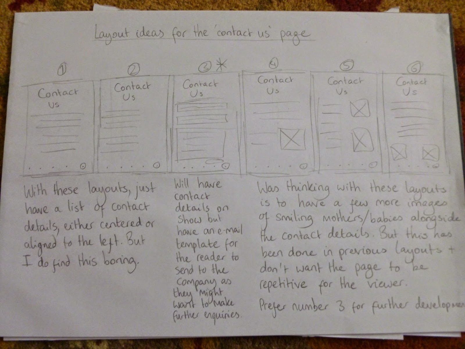
To start, I did some research into a range of webpages and how I could present my information. (My analysis is available to read in the images). 


From that, I moved onto designing some ideas. My favourite idea was no. 5 as I preferred the organised layout and I wanted to mix the long image infographic style with a timeline effect.  


With my chosen idea, I moved onto trying a range of colours from the chart I made. I preferred the balance of the dark blue colours as these looked to have strong potential.  


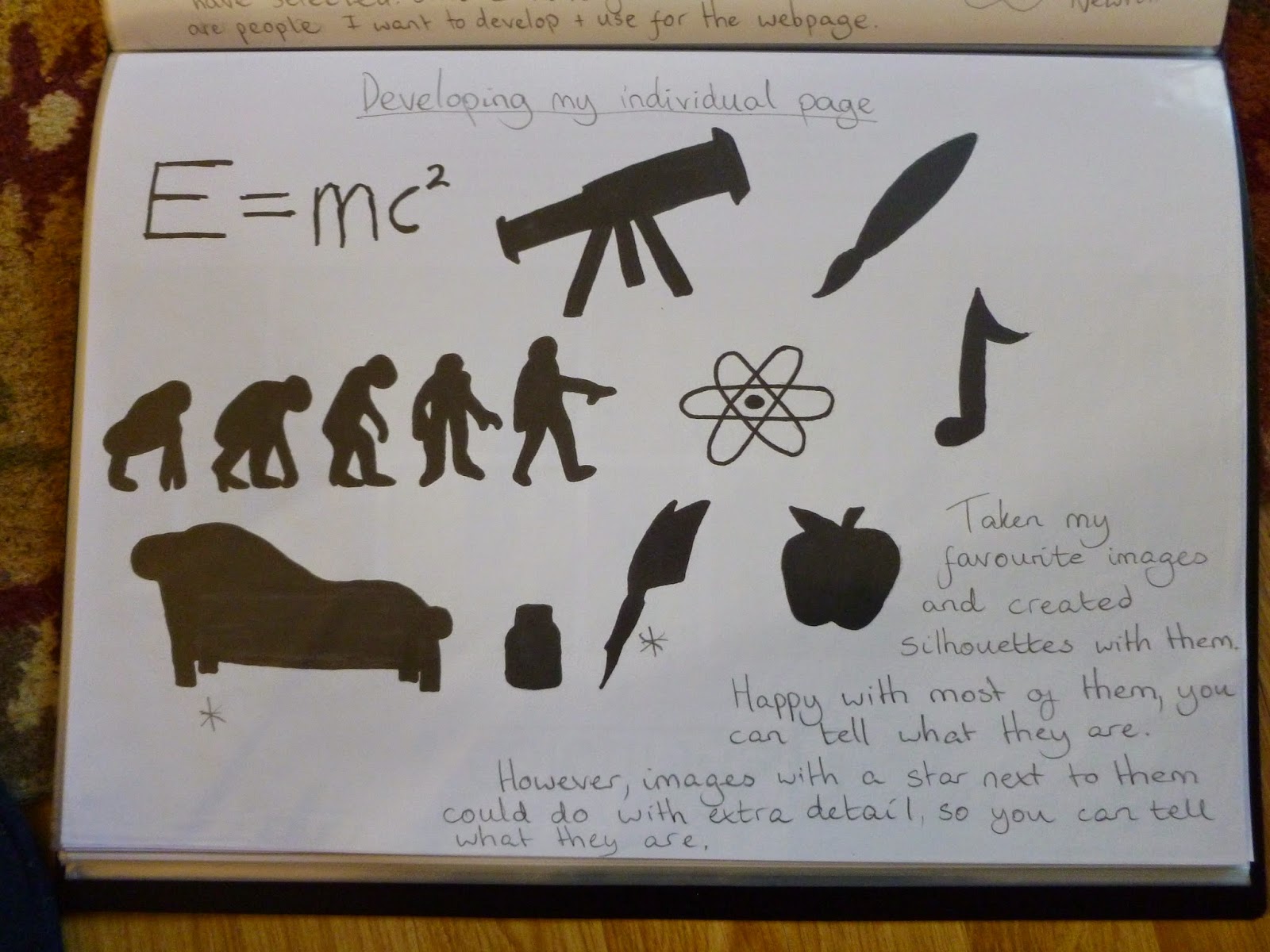
With the colours sorted, I thought of some images that could be placed on the webpage. The picture on the right shows the compositions more refined, along with being whittled down from the previous drawings on the left image. 


Pleased with how the drawings appeared, I drew them on Illustrator, along with using the colours I preferred. You can see my analysis in the images. 


With the images drawn on Illustrator, I made some practice layouts on Photoshop using the colours I was most pleased with. My analysis is in the image.


After editing the colours and text, this is the version I was most pleased with. Again, analysis is in the image. 


After finding out other colleagues in our group already used dark blue colours, myself, Lisa, Laura and Antony had to have a re-think about the colours. In the end we went for purple, with the image above showing a practice layout using various shades of purple. This did look to have potential.


Happy with the background and line colours, I tried various hues for the images. In the end, I went for a lighter shade of purple, as this blended well within the composition. 


With the colours sorted, our group moved onto deciding where the hyperlinks should be placed, along with how they should look. In the end, we decided to place them at the bottom and have the themes written out. This style would also be easier to help organise the hyperlinks.


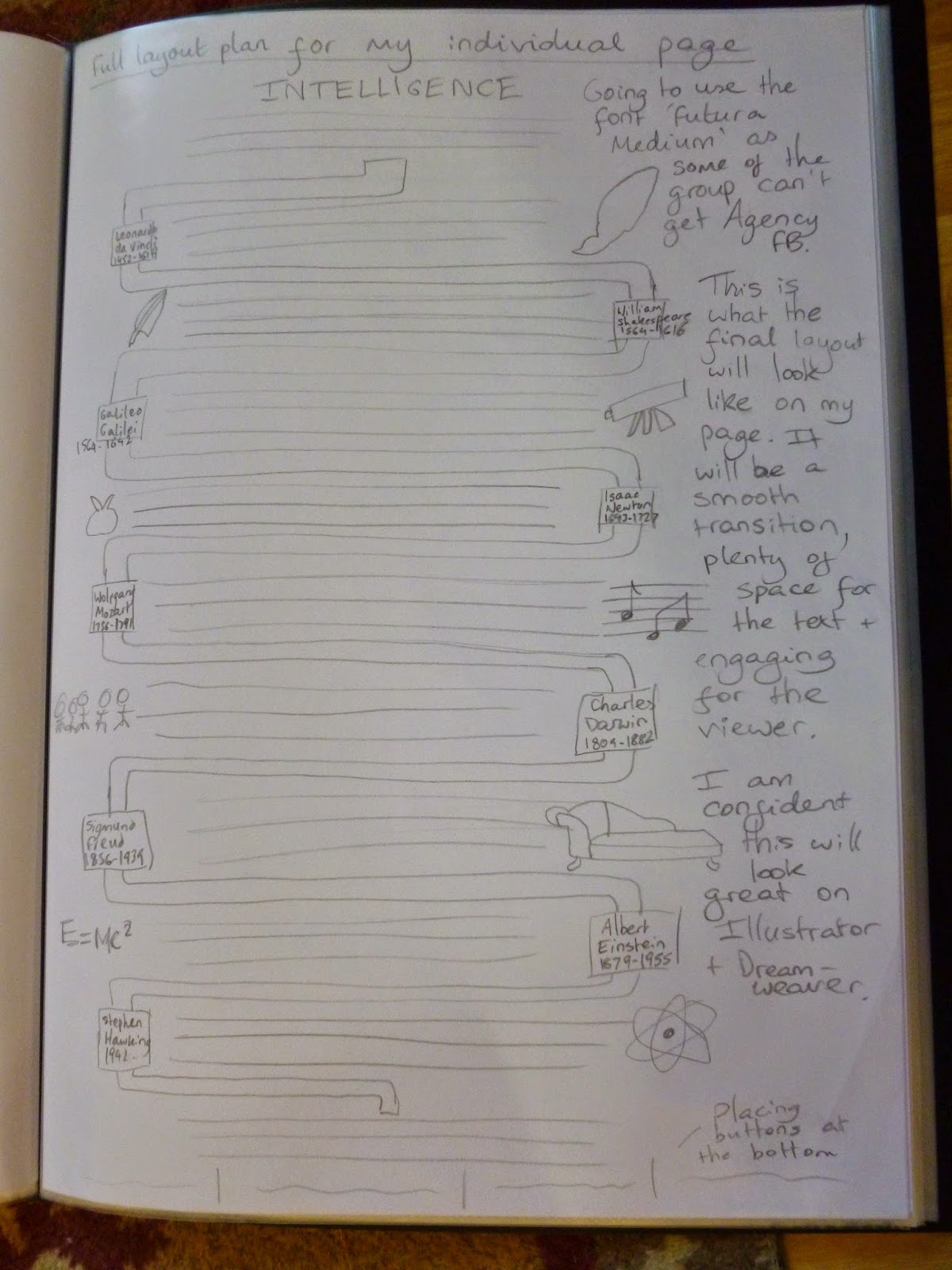
With everything sorted, I drew out the full layout of my webpage. I was ready to make this on Illustrator and place this on Dreamweaver!


This is my final layout of my individual page. You can see my analysis on the image.


With everything done, I placed my infographic/timeline onto Dreamweaver. From that, I was able to view my webpage on Safari. Again, analysis can be read on the image. 


This is my final webpage which you can view on a larger scale. 

Overall, I have found this brief to be a challenge, especially trying to use Dreameaver! However, this has been a learning curve and I have gained a lot of knowledge on using this software. 

The next brief for university will be about branding a small island. Very interesting times ahead!

Mike 

Sunday 9 November 2014

Group Critique for Baby Supplement Brief

Following from completing the baby supplement brief, our tutor asked us to note down our analysis of everyone's work. Below are the 4 points we used to consider when discussing their work:
1. Language
2. Colour
3. Image
4. Nutritional message/positive message

Alex
1. The language is informative.
2. The colours are bright, but it would be good to try out different variations.
3. I did feel the imagery was a bit stereotypical, but the people do look happy.
4. The message is clear to the viewer and is well informed.

Chloe
1. The language is readable.
2. A good variety of colours. There is a bit of white space on show too which I think is very important.
3. Nice choice of images, the mum and baby appear happy.
4. There is an emphasis on the product being 'free', but not so clear on the message that is being outlined.

Shannon
(She designed an alternative healthy product to the brief due to ethical grounds).
1. The language is clear.
2. The colours are bright and link with the chosen fruit. They will stand out in a supermarket.
3. The images link with the product advertised and I like how it is in the shape of the fruit advertised.
4. We are not sure if it is free.

Kerri
1. The language is informative, yet straight to the point.
2. It is nice to see a few more varied colours, but the chosen ones suit the subject matter.
3. Images link well with the subject.
4. The message is clear and viewers will know who it is for.

Chris
1. Language is clear and is not too much in the way.
2. Colours link with South Africa and there is a good variety.
3. The South Africa flag is on show but a bit too predictable?
4. The message is on the packaging, but not all of it is noticeable straight away. I am also unsure if it is free too.

Antony
1. I am unclear on what is being said.
2. It would be nice to see more variety.
3. I appreciate how he is thinking outside the box, I like that.
4. He has covered all the basics needed for a first time mum.

Jason
1. There is little information on show.
2. No colour.
3. The images link with the subject but it would need more clarification. 
4. Message is unclear so I cannot tell what is being advertised.

Thayf 
1. The language is informative.
2. Colours are not too heavy, but the designs would need a colour that is eye catching.
3. Images are a good choice but it would be nice to see black and white babies together, so there are no race issues.
4. There are good buzzwords and are outlined.

Ricky
1. It is great to see he has used both languages (English and South African). He has thought of everything.
2. They are simple, clean, modern and there is not too much colour on show so confusion is little.
3. Images of babies are there.
4. The nutritional message looks to be evident. 

Mike  

Visualisation assignment: Baby Feeding Supplement

The final one week brief that had be completed was to design a social media campaign for a new baby supplement. This would be aimed for infants aged between three months and one year and each sachet would be mixed with 20ml of warm water to provide all the nutrients required for the important early months. The target audience would be young mothers in South Africa (who will get a free two weeks supply over a period of six months), with the aim of providing the benefits of using MM formula.

A major ethical concern with this brand is that Nestle tried to run a similar campaign and faced a lot of negative publicity. Also, these young mothers might not have enough money to continue paying for the formula after the free sample and they may not have clean, warm water to mix the supplement. If the supplement is stopped and/or mixed with dirty water, the baby is not going to get the nutrients required and could die because of this. Over the week when I was completing my ideas, I felt uneasy about the purpose of this company as I would not like to be part of a brand that is responsible for young deaths in South Africa. If I was forced to design a social media campaign for this, I would make sure it was advertised truthfully and the consumers are fully aware of the implications/requirements of the product. 

Regarding my designs, I started off by choosing a font. I wanted a sans-serif font that looked clean and modern. This should appeal to the consumers. 


Next, I thought about app logo ideas. I thought the 'MM' would stand out well on the logo and having 'formula' underneath would inform the viewer of who this brand is. Idea 4 was my favourite and I wanted to develop this further.


Following from sorting out the logo, I moved onto thinking about how the viewers will get from one page to another. I considered placing buttons on the pages but I prefer the idea of using your finger to swipe from one page to another (similar to using an iPad/iPhone) as it is modern and showing the brand is up-to-date with technology. 


After completing this, I considered the layouts for all the pages. I wanted each page to be different and at the same time, present the information in a clear and concise manner. 


With the layouts organised, I tried out various colours for the app logo and homepage. I aimed to use pastel colours as this would imply a softer approach to the viewer and would suit the target audience. In the end, I chose the bottom middle colour and it is not gender specific and the text is readable. 


With my preferred colour chosen, I placed this on the rest of the pages. I feel this colour suits all the pages and sets the right tone about the main subject (the baby supplement).


With all aspects of the layouts and app logo completed, I placed these designs on mobile devices. Overall, I think the app logo fits in perfectly with the other apps and does not appear out of place. As for the pages, the layout is clear and the pages look readable. These layouts should be easy to understand on a mobile device.


These past three weeks have been intense but my visualisation skills have improved. When I undertake more briefs in the future, I will aim to maintain this level of generating ideas.

Mike