The first one was all about working with type, with the final piece involving myself to create an A2 piece on InDesign showcasing my chosen font, the alphabet and the name of the font.
To start, I did some research into designers who have worked with type and I found influential in helping me complete my thumbnail drawings. Examples like Harry Heptonstall, Herb Lubalin, Josef Muller-Brockmann, Watafak and Swiss Style were influential in helping me progress in my work. I have attached a few examples of their work.


(Harry Heptonstall)
I was intrigued by the way he has created simplistic designs that are also captivating. The 'Ouch!' piece was influential in making me think about using a word that represents graphic design using my chosen font. I also found the 'partners' logo clever as he has used the letters 'P' to make a pair of scissors. I am interested in combing letters together to represent an image.


(Herb Lubalin)
Again, I have been intrigued by the way he has merged the words into the subject. I find this a compelling way of making text fascinating for the viewers and has given me thoughts for my designs.


(Josef Muller-Brockmann)
I was engaged by the way he has implemented a sense of movement into his work that appears like he is communicating to the viewer by sound. I am also intrigued by the way he has blended text in 'der Film'. This is something I want to attempt in my designs...


(Swiss Style)
I am a big fan of this movement as I prefer the cleanliness, readability and objectivity of this type of work. In my designs, I want to implement a grid system and a design that has a visual impact on the viewer.


(Watafak)
This is the final artist/movement I researched. He was a unique person for me as I did not think splitting up letters would work. However, he proved me wrong and am in awe of his work. I would like to attempt a similar style to see if I can create an abstract design.
After completing my research, I moved onto my development. I was given the font Franklin Gothic which would have not been my first choice but I was up for a challenge. To start, I had to think of ways of creating abstract shapes using my chosen font.


These are my three abstract letter form sheets. I experimented with the composition of each letter and various font styles. I was also more confident after completing each one and inspired me in thinking of creative designs using my chosen font.


After doing the abstract letter forms, I moved onto creating some interesting compositions. I started by having a play of the positioning of the letters and developed a few further by using a black ProMarker. I was interested by the bottom right design but none were standing out for me.


This time I put more thought into the ideas and decided to use words that link with graphic design, rather than various letters. It was a risk but a few did catch my eye, especially the 'connect' piece. To develop them further, I increased the size of them to A3.


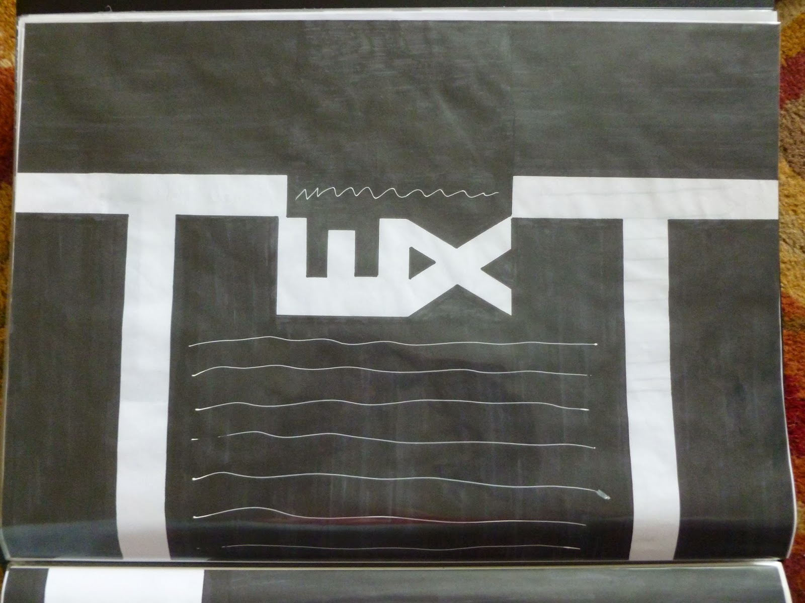

These were the four ideas I wanted to develop further from my thumbnails (all hand rendered). I found 'tone' to be a bit boring and not exciting enough. I did edit 'image' further by making the letters more readable but again it was not standing out for me. This was the same for 'text'. However, 'connect' was my favourite and loved the potential of this. This was the design I wanted to go further with.

Next, I played around with the positioning of the text as it was dull. There were a few thumbnails I was interested in and I wanted to increase the size of them to get a better understanding of the composition.


I drew my four favourite designs onto A3 sheets with the grid system implemented. Out of all of them, I preferred the fourth one as I felt I had got the composition right in terms of not having too much white space on show and using the space effectively. I found the other designs to be too small on the page. The final task to do was increase the size to A2...


These are my final pieces of this project. The left sheet is a hand-rendered design whilst the right sheet was completed on InDesign. Overall, I am very happy with the composition as it is different and a great way of advertising my font, as I found out this typeface has been used a lot in books and billboards. This then made me realise this font 'connects' with the viewer, which is the whole point of Graphic Design.
Mike
References:
Harry Heptonstall - http://www.harryheptonstall.co.uk/
Herb Lubalin - http://www.wedesignandconquer.com/the-late-great-herb-lubalin/, http://www.aiga.org/uploadedImages/AIGA/Content/Inspiration/aiga_medalist/MD_LubalinH_Logos_640.jpg
Josef Muller-Brockmann - http://www.designishistory.com/1940/joseph-mueller-brockmann/, http://rhodrievans.wordpress.com/2008/12/23/josef-muller-brockmann/
Swiss Style - http://swissgraphicdesign.blogspot.co.uk/2011/04/swiss-style.html
Watafak - http://www.watafak.com.ar
No comments:
Post a Comment