Monday 17 February 2014

Reflective review

During my week off at university, I am required to reflect back on the four graphics projects I have done and to see how much I have developed over this time. 

Project One

1. I have already shown the stages I went through for the first project (which can be seen here: http://mph94.blogspot.co.uk/2014/02/the-first-uni-project-thinking-with-type.html) so I do not need to repeat myself. 

2. Three things I have learnt from this project were that InDesign can be used not just for creating magazine pages. For my final major project on the Foundation course last year, I used InDesign a lot to create a motorsport magazine. Completing this project made me realise that this software can be used for other purposes (the grid system came in very handy). 
I also learnt that taking risks is fine. My time at university is a great opportunity to do this and I was struggling to come up with an abstract design using my font, so choosing a graphic design word was risky compared to what my peers were designing. 
The final thing I learnt from this project was that I did not have to include every artist that was mentioned in the project. On the first week, I spent a lot of time researching images that probably would have not been influential to me so I know for next time to just include people I will find beneficial to me. From that, I could spend the other time to complete development sheets. 

3. Three skills I had and was able to demonstrate in the project was being able to know my way round InDesign. As mentioned previously, I had already used the software a lot on my Foundation so I was not a total beginner using it. 
I was also able to show that I could come up with various ideas. Anything that pops up in my head I will draw out as any idea is not a bad idea.  
As well as this, again the experience I gained on the Foundation came in handy as I had already done abstract letterforms. I enjoyed doing these and was happy to develop my ideas further with a different font. 

4. Three things I wished I did differently if I started the project again would be to read the brief properly again, as I made a few silly mistakes early on. For example, on my first abstract letterform sheet, I used a different letter for each box, when what I should have done was use one letter for each row (you can see this on the hyperlink above). I was a bit rusty starting uni but I have learnt from that error and I now thoroughly read the brief.  
Next time, I would like to be more creative with my ideas, and form my letters into pieces of art. Instead of doing the graphic design words, I wished I focused on merging a few letters together. 
Also, I would use a grid system earlier on in my design ideas as I would have not known how to structure my piece correctly without this. I realised how beneficial the grid system was when completing my A3 drawings, so I would definitely use the grids earlier on.

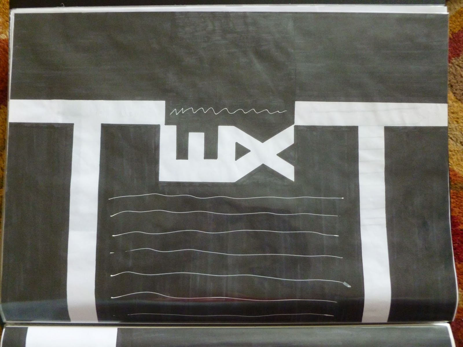
5. The biggest problem I encountered on this project was trying to get the layout right for the 'connect' piece. On most of my ideas, I noticed I had too much white space on show (especially being on A2 for the final piece). Because of that, I had to split up the word to fulfill the space I had. It was what I did not want to do at first but in the end it turned out to be the better design.  

Project Two

1. Moving onto project two (packaging), again I have already posted the stages of this (which can be seen here: http://mph94.blogspot.co.uk/2014/02/the-second-uni-project-packaging.html). 

2. Three things I learnt from this project were being able to use the pen tool on Illustrator. I have normally avoided using it but I wanted to have a go and take myself out of my comfort zone. Even though I only used it to draw a Tic Tac, I am a lot more confident using this tool effectively. 
I also learnt how to work with nets. I have not done that before so it was a great opportunity to figure out the way of linking all the sides together (especially the Red Bull and Tic Tac nets!)
Finally, I have learnt how to analyse brand packaging better, especially with what colours and type they use to help convince the customer to buy their products. It is a step further in the way I analyse my research. 

3. Three skills I already had and used effectively in this project were being able to write detailed annotation about my work. As I am not beside the person marking my mark, I like to make sure the examiner is clear on what decisions I took and the process of how I completed a piece of work. 
I also showed that I was able to complete plenty of research to get loads of ideas to inspire me. Within the two chosen categories I selected (energy drinks and chewing gum), I wanted to make sure I had a broad range of packaging designs to give me inspiration.  
As well as these skills, I showed that I could develop my chosen ideas further by creating them on the Mac. I managed to display that I did not discard any designs until I made them on Illustrator. 

4. If I were to start this project again, I would definitely try to get an equal amount of brand values shown better in my designs. For instance, on the 'energy gum' designs, I only took the box of the chewing gum brands and replaced the design with an energy drink brand. Next time, I would like to challenge myself and mix both packaging designs better. 
It could also be a possibility that I would try various nets on all my designs instead of just the one, just to show I have considered other options.
I would also take my favourite idea and develop it first on one net and then apply it to other nets, instead of developing my best idea as I used the other nets like I did on this project. I would then have a better understanding of what net would work best. 

5. The biggest problem I encountered on this project was using the pen tool. I struggled a lot getting to grips with it as I found the tool very difficult to make understandable shapes. From that, the Tic Tac design was my best choice as I could draw basic images without too much difficulty.       

Project Three

1. With project three (designing for screen), it was more about the development process than producing a final result. For the first stage of the project, I created a timeline of my life (see image 1), in which I included areas in my life that have been influential for me. I then did a comparison of Creative Review and Design Week's paper based and online magazines. I also did some research into blogs to determine which one I would use to publish my work (blogger being my choice). 

Image 1
After that, I did further research into paper based navigations that I found influential (can be seen here: http://mph94.blogspot.co.uk/2014/01/my-influences-for-this-project.html). From that, I completed some thumbnail drawings for paper based navigations (see images 2-5) and then worked on some prototypes (they can be seen here: http://mph94.blogspot.co.uk/2013/12/prototype-making.html). 

Image 2

Image 3
Image 4

Image 5

Finished with the paper based navigations, I moved onto web based navigations. I started by categorising my timeline into various subjects and bite-size chunks (see image 6). After that, I worked on various navigation maps to present my data (see images 7-8).

Image 6

Image 7

Image 8

Following from that, I did some research into a theme I could use across my drawings. Once I had my theme I worked on various screen drawings and adding colour to my favourite drawings (all can be seen here: http://mph94.blogspot.co.uk/2014/01/going-underground.html and http://mph94.blogspot.co.uk/2014/01/update-on-my-drawings.html). 

2. Three things I learnt from this project were various ways of making webpages/apps creative and not static. The ones my tutor showed me influenced me in designing my wireframes.
I also learnt how to make pop-up pages. I was struggling at first, but I self-taught myself and managed to achieve some decent results. 
Alongside this, when completing my research, I learnt that work related to my main subject can also be beneficial. I was inspired to do this with my London Underground research and it proved to be effective. 

3. Three skills I already had and was able to use were trying out various ideas with my drawings, which I evidenced well in my London Underground thumbnails. 
I gathered plenty of research to help improve my knowledge and ideas for paper based/web based navigations   
I came across a problem and was able to solve it myself.

4. Three things I would do different if I started the project again would be to evident my research into creative webpages/apps. I did see them in a lecture by my tutor but I didn't show any images in my workbook.
I would like to add more colour to other thumbnail drawings, other than just my favourite ideas as this will show I have developed other designs further.
Try and be more experimental with the paper based navigations. I think I did plenty of pop-up pages so the next step for me would be try other alternatives.

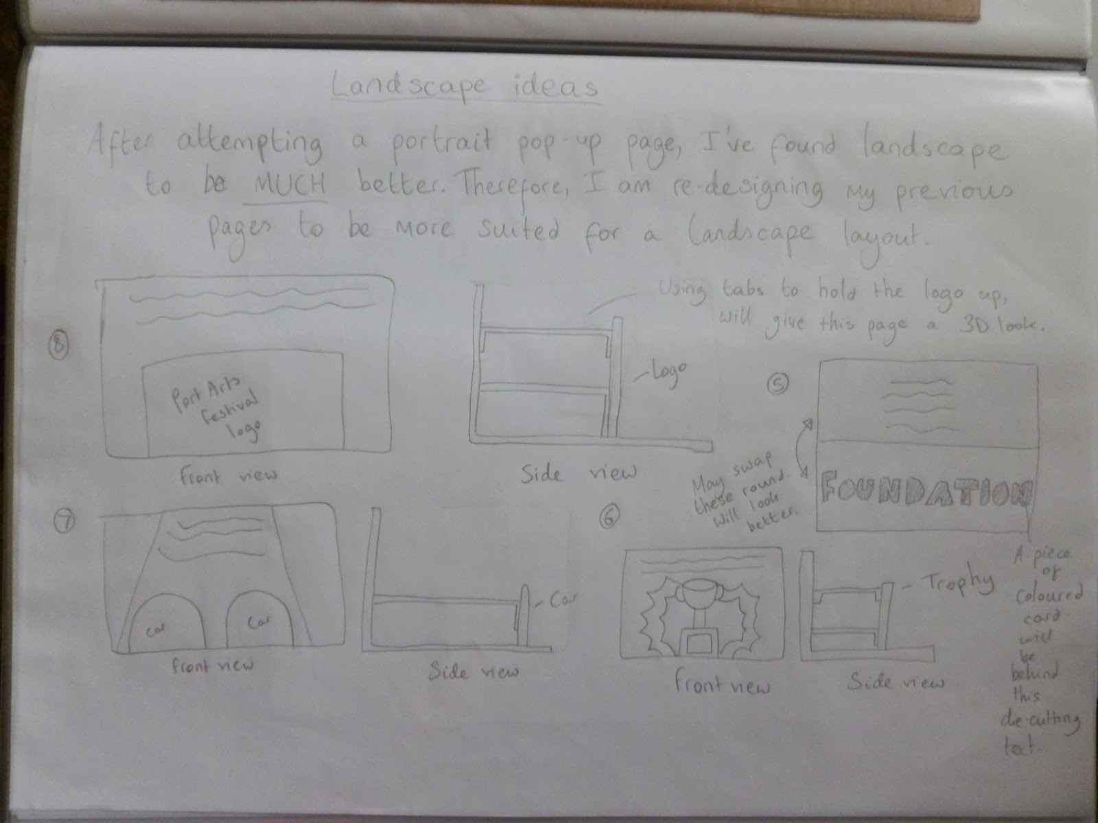
5. The biggest problem I encountered on the project was trying to create effective pop-up pages. I tried a landscape format at first but that did not work. But once I did some research into techniques, I realised I had to set the book portrait for the pop-ups to work. It was not my preferred choice but it was pleasing to see the pop-up pages work.  

Project Four

1. The last project I completed was about infographics. I started off my brainstorming some ideas with my group, got the questionnaire completed by the graphics group I work with and then organised the data to see what themes I could go forward with (see image 1). 

Image 1

The rest of the stages of this project can be seen here: http://mph94.blogspot.co.uk/2014/01/new-project-research.html and http://mph94.blogspot.co.uk/2014/02/developmentconclusion-of-project-four.html. 

2. Three things I learnt from this project was that data can be beautiful to look at.
Adding colour can help cement ideas. When I included colour on my sports results infographic (inspired by Keith Haring) I was sold on the design and wanted to develop it further. 
The original thumbnail drawing will change. I thought when I first drew my sports results infographic it was brilliant and did not need major changes. However, having feedback from my tutor and peers prompted me to make edits that made the original drawing completely different to the final piece. 

3. Three skills I could use in this project were being able to use the paint brush tool on Illustrator. I have had a bit of experience using it on my Foundation course and I am a lot more confident using that compared to the pen tool. 
I also could abstract ideas as much as I can and then convert them into concepts. I feel I have done this to a few of my thumbnail drawings.
I always plan on taking advantage of the sources available at my uni. In this case, I managed to photograph the pages inside the book 'Information is Beautiful'. This was a massive help in thinking of design ideas.

4. If I were to start this project again, I would make sure my design ideas are not too alike to my research (my sports results infographic and Keith Haring). If it was a live brief, I would avoid copying my research as I do not want to be faced with a copyright issue.  
I would like to add colour to more ideas for a comparison. That would increase my development.
From that, I would like to try a few more ideas on Illustrator/Photoshop, again to see what design I could go further with. I felt with this brief I favourited the sports infographic and should have spent more time on developing other thumbnail drawings.  

5. The biggest problem I had with this project was trying to find a way of presenting my data on my infographic creatively. At times, the text proved to be lackluster in comparison to my drawings or did not look right against the figurines. However, I managed to find a great combination that I was very satisfied with. 


6. Moving onto discussing all the projects, I would say my favourite pieces of work were the Tic Tac packaging and the sports infographic. This was due to the amount of hours I spent working on them using software I was not fully confident on, which inspired me to complete them to a high standard. I was very satisfied with both pieces.


7. Looking back at all four projects, the areas I could work on to improve myself and the quality of my work would be to know what the brief is asking. Especially on project one, I made a few mistakes due to the fact it was not what the brief was requiring. I will also make sure I collect research for all areas of the brief so I can have a wide knowledge of various sections and will hopefully improve my ideas. As well as these, I would like to develop more of my ideas using various colours, type and layouts. Doing this would broaden my development. Finally, I would like to try and make more ideas on software to help me decide what design I would go further with, instead of favouriting one. 

8. Lastly, if I had a chance on the next project, I would love to make a final product that is just not restricted to being on a screen/paper. It would be great to have a piece that could be printed on a 3D object (like a box or a crate). The image below shows off something I possibly would like to try if I had the opportunity (artist is Alan Herron).  


Focusing on photography research and collecting props for my photo-shoots this week. I am quite excited for that along with the trip to London for the 4 Designers conference this Sunday too, should be good!

Mike

Reference:
Alan Herron picture - http://mph94.blogspot.co.uk/2014/02/developmentconclusion-of-project-four.html

Saturday 15 February 2014

The second uni project: Packaging

My second project at university was about packaging. The final result would be myself creating a box that had a 'new look' for a familiar brand. My tutor emphasised the design process which was about thinking of an idea to solve the problem, generate designs that were 'abstract' and then refine them into concepts that could work.    


To start, I created a mood board that showcased packaging designs which had an 'abstract' look to them, and I could use for inspiration. A few caught my eye and I wanted to research them further. 

From that, I went off and drew my favourite designs from that mood board and other brands I wanted to merge. My tutor requested that I mix two brands that were completely different and that they were hand drawn so I could understand the visual language, colour and the typography used. 


This is my first sheet of development. I was interested by the left design as I thought it was a clever way of tackling the issue of digestive problems. Having these type of meats as target practice was creative. However, the right design caught my eye as it was bold in colour and could work with a variety of colours. It inspired me to analyse various chewing gum brands as I was interested in this type of packaging.


I found these packaging designs suitable for hotels as they are compact and easy to use. They also linked highly with the type of product they were (the left package being designed to allow the person to spread their butter and the right design shaped as a strawberry). However, it was not standing out for me so I discarded these type of products.

After careful thought, I decided to focus on analysing energy drinks and chewing gum brands as I am a fan of energy drink packaging designs and that abstract design of the chewing gum brand really caught my eye. It was from that I moved onto drawing the packaging of these categories. 


The first energy drink brand I looked at was Red Bull. They are a highly recognisable brand and have a distinctive colour scheme. I noticed there was not too much text and images on show and the use of colours suggests 'intellect', along with emphasising "speed, power, risk-taking and aggressiveness." In my designs, I wanted to implement this house style with a chewing gum brand. 


The next brand I drew was Relentless. Compared to other logos, this was unique in terms of its complexity and the brashness it showcased off. This type of logo would suit the target audience well (young people) and emphasises the brand is imaginative and a visual creator. It would be interesting to see how this logo would appear on a chewing gum packet. 


What instantly grabbed by attention about the logo was the star. The bright yellow colour works brilliantly against the black and would love to implement this into a chewing gum brand. Also, the layout is not too busy and the company have used colours that catch the viewers eye. These are pointers I will be considering when combining two brands. 


The use of the black background again has proven effective in helping the colours jump off the can. I also admire how they do not change the layout of the packaging which I think is very important for brand recognition and that the customers are not confused. The simple Monster logo works very well relating to brand values and is not over complicated. For my ideas, I will be considering about a design that works with a variety of colours.


The final energy drink brand I drew was Mountain Dew. I found this design to be different to others as the vibrant colour of the bottle was a stand out feature for me. Also, the logo has a sense of movement about it, which links highly with the whole purpose of an energy drink. It was also pointed out by my tutor that having a darker green colour for the logo works well alongside the bright bottle as it is not too distressing on the eye. Again, I would be considering this for my designs. 


Feeling confident with the energy drink brands, I moved onto chewing gum brands. I started off with Tic Tac and thought this logo could do with an update. However, the designers have taken the advantage of using the tic tac's well by using them as the colourful background. I also took note of the slogan "refreshing little lifts". I have an idea of using that along with an abstract design I previously analysed.  


I also researched other chewing gum brands. I noticed all the packaging was compact and could easily be placed into a bag with ease. With the Extra packet, the colour blue suggests minty freshness and relates to a typical gum colour. With Trident, it is clear that they have used a background colour that relates to the gum flavour. This is something to remember when adding colour to my designs. Finally, the 5 gum is a contrast in terms of layout as I found it to be a modern design compared to others. The packet suggests a product that is stimulating and lively and again, the logo is simple and is easy to remember. It was going to be interesting merging these with energy drinks!


This was my first design idea for my packaging. I have taken the Gubble Bum packaging, the Rockstar energy drink star and the Tic Tac font and colourful tic tac's. It was a great start as the abstract design involved lifting the outer packaging to access the tic tac's. But by doing that, the packet reveals the Tic Tac slogan "refreshing little lifts". I love this and will be keeping this design. However, I want to implement the Rockstar house style further by using that brand's font. I decided to develop the logo further. 


I used the Rockstar font and a brighter green for the star. I tried an abbreviation similar to how the Rockstar logo appears but I do not think every customer would recognise who the brand is. Plus, it would be the only piece of text on the front packet to tell the viewer what the company is called. Therefore, I tried another idea, in which I included the full name of the brand. I found this to work a lot better and will be implementing this when making my designs on Illustrator. 


On this design, I combined the packet of Extra gum and implemented the Red Bull house style. I thought this could be a new market Red Bull can enter, creating 'energy gum' for customers. I would like to try this idea on Illustrator. 


I combined the packaging of Monster and house style colours, and then used the 5 energy logo. I thought this would look great as a new energy drink in which it can "unleash your 5 senses". Also, the colour of the logo can change and would still be distinct (like the Monster cans). 


The final design I completed was similar to the Red Bull one. Again, I thought of doing 'energy gum' by combining the Relentless logo and colours and Trident packaging. It is not my favourite design as it is too simple but I still wanted to make it on Illustrator to help build up my experience. 


Following from drawing out my ideas, I moved onto creating them on Illustrator. After doing this, I was definitely not taking this further as it is too basic and trying to draw the Relentless logo for real would have taken me a lot of time. Also, I do not think I implemented the Trident packaging design enough so I discarded this idea. 


I did struggle a lot trying to make this net as trying to line up the background was very difficult. Also, again I do not think I implemented the brand design of Extra gum well so I was happy to discard this idea.


At the time of completing this, I thought this was the better idea. Unfortunately, I did not have a net of a can so I had to use one I thought resembled the packaging of one. Still, I think I did a better job of combining the two brand values and do think this design could work well as a genuine product. This idea did have potential.  


I was seriously impressed with the potential of this design. I created the tic tac's on Illustrator and feel they look great on the packaging. I was very satisfied with this idea and wanted to develop it further with other nets. I was also happier with myself that I have done a better job of combining the brands together. However, I think a few edits can be made, such as the layout of the tic tac's and making the text bolder as from a distance it cannot be seen well. This could be an issue with customers who may have poor vision. 


I attempted the design on another net and you can see that I have given the tic tac's a better structure. You can also see on the right the inside packaging which will reveal the message. On the other hand, you might not be able to see the bolder text I implemented. Because of this, I would not be going further with this net as I think it is too small for the viewer to see.


This was the hardest net to use as given by my tutor, but I wanted to give myself a challenge. I managed to understand how the box would be put together but I struggled lining up the tic tac's right. Because of that, I discarded this net and went back to the first one. I was a lot happier and confident with that box. 


Confident with the right net, I implemented the changes I did on the other nets. You can see the text a lot better and the design has a better structure to it. This was a practice print so I was ready to make the final product!


These are photos of my final product showing all sides of the package and the message when you lift up the outer box. It has been very rewarding to create a net that I designed on Illustrator that I was satisfied with.

I have now shown you all four projects I completed at university so far. There have been a few late nights but overall, I feel I have improved my skills from my foundation course and am looking forward to undertaking the next two projects! I shall also be providing a reflective review for all the graphic design projects on here soon.

Mike  

Friday 14 February 2014

The first uni project: Thinking with type

Since I started my blog on the third project at university, I have decided to post my first two projects so that you don't miss out! ;)

The first one was all about working with type, with the final piece involving myself to create an A2 piece on InDesign showcasing my chosen font, the alphabet and the name of the font. 

To start, I did some research into designers who have worked with type and I found influential in helping me complete my thumbnail drawings. Examples like Harry Heptonstall, Herb Lubalin, Josef Muller-Brockmann, Watafak and Swiss Style were influential in helping me progress in my work. I have attached a few examples of their work.


(Harry Heptonstall)

I was intrigued by the way he has created simplistic designs that are also captivating. The 'Ouch!' piece was influential in making me think about using a word that represents graphic design using my chosen font. I also found the 'partners' logo clever as he has used the letters 'P' to make a pair of scissors. I am interested in combing letters together to represent an image.


(Herb Lubalin)

Again, I have been intrigued by the way he has merged the words into the subject. I find this a compelling way of making text fascinating for the viewers and has given me thoughts for my designs. 


(Josef Muller-Brockmann)

I was engaged by the way he has implemented a sense of movement into his work that appears like he is communicating to the viewer by sound. I am also intrigued by the way he has blended text in 'der Film'. This is something I want to attempt in my designs... 


(Swiss Style)

I am a big fan of this movement as I prefer the cleanliness, readability and objectivity of this type of work. In my designs, I want to implement a grid system and a design that has a visual impact on the viewer.


(Watafak)

This is the final artist/movement I researched. He was a unique person for me as I did not think splitting up letters would work. However, he proved me wrong and am in awe of his work. I would like to attempt a similar style to see if I can create an abstract design.

After completing my research, I moved onto my development. I was given the font Franklin Gothic which would have not been my first choice but I was up for a challenge. To start, I had to think of ways of creating abstract shapes using my chosen font.  


These are my three abstract letter form sheets. I experimented with the composition of each letter and various font styles. I was also more confident after completing each one and inspired me in thinking of creative designs using my chosen font.


After doing the abstract letter forms, I moved onto creating some interesting compositions. I started by having a play of the positioning of the letters and developed a few further by using a black ProMarker. I was interested by the bottom right design but none were standing out for me. 


This time I put more thought into the ideas and decided to use words that link with graphic design, rather than various letters. It was a risk but a few did catch my eye, especially the 'connect' piece. To develop them further, I increased the size of them to A3. 


These were the four ideas I wanted to develop further from my thumbnails (all hand rendered). I found 'tone' to be a bit boring and not exciting enough. I did edit 'image' further by making the letters more readable but again it was not standing out for me. This was the same for 'text'. However, 'connect' was my favourite and loved the potential of this. This was the design I wanted to go further with. 


Next, I played around with the positioning of the text as it was dull. There were a few thumbnails I was interested in and I wanted to increase the size of them to get a better understanding of the composition. 


I drew my four favourite designs onto A3 sheets with the grid system implemented. Out of all of them, I preferred the fourth one as I felt I had got the composition right in terms of not having too much white space on show and using the space effectively. I found the other designs to be too small on the page. The final task to do was increase the size to A2...


These are my final pieces of this project. The left sheet is a hand-rendered design whilst the right sheet was completed on InDesign. Overall, I am very happy with the composition as it is different and a great way of advertising my font, as I found out this typeface has been used a lot in books and billboards. This then made me realise this font 'connects' with the viewer, which is the whole point of Graphic Design. 

Mike

References:
Harry Heptonstall - http://www.harryheptonstall.co.uk/ 
Herb Lubalin - http://www.wedesignandconquer.com/the-late-great-herb-lubalin/, http://www.aiga.org/uploadedImages/AIGA/Content/Inspiration/aiga_medalist/MD_LubalinH_Logos_640.jpg
Josef Muller-Brockmann - http://www.designishistory.com/1940/joseph-mueller-brockmann/, http://rhodrievans.wordpress.com/2008/12/23/josef-muller-brockmann/
Swiss Style - http://swissgraphicdesign.blogspot.co.uk/2011/04/swiss-style.html
Watafak - http://www.watafak.com.ar