Following from the research I did previously, my tutor showed me a book called 'Information is Beautiful' by David McCandless. I was absolutely enthralled by this as there were a lot of interesting designs I could take to help influence my ideas. Below are a few pictures showing my favourite infographics.


From that, I moved onto creating some thumbnails of infographics related to my questionnaire results.

On this sheet, I started doing some basic diagrams by using a bar chart, a pie chart and a tree map. At the
moment, they are lacking in vision and imagination but it has been a good opportunity
to understand these types of charts.

I took the basic diagrams I did previously and implemented a style from a few infographics in 'Information is Beautiful'. I liked the idea of replacing the bars with glasses/monuments that represented the information collected, but I thought that was too basic and still not imaginative.

Still taking inspiration from 'Information is Beautiful', I thought of ditching the charts and going for a different approach. On the clothing brand, I used tags to present the data. However, this design was not exciting enough for me. The drink idea was another interesting one but I thought it was a bit predictable. Finally, the social network thumbnail was about using the layout of the social networks and changing them to present the results. It is an engaging design but I was not sure if I could duplicate a similar layout of Tumblr and Bebo. Therefore, I discarded this one.
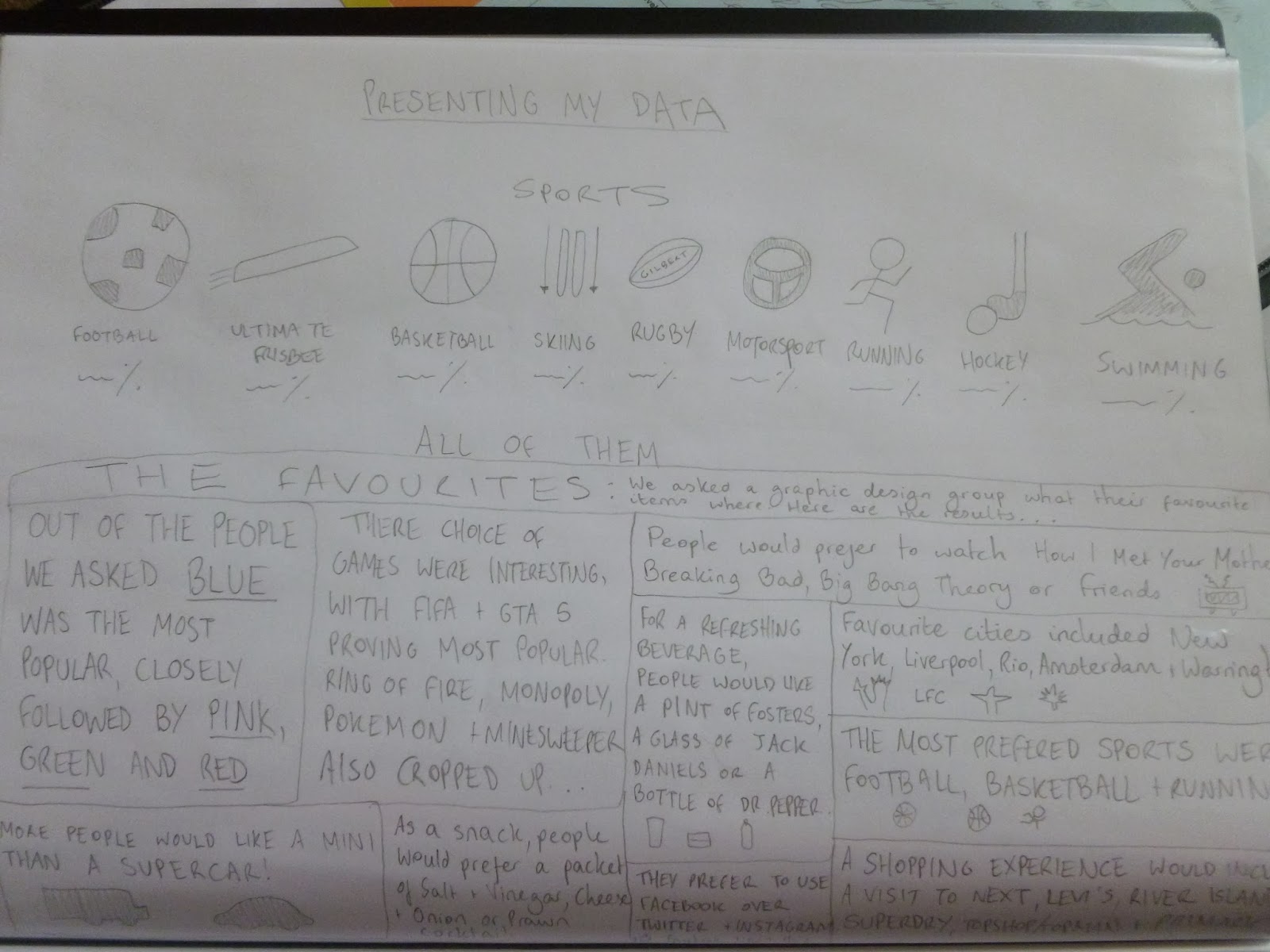
I am pleased with these designs. The top one focuses on the sports results and using a simple image to represent the sport. After further analysis, I think it was too basic and I would go back to the drawing board to think of a striking design that is unique. The bottom thumbnail was influenced by the 'Austin sucks' poster and was all about showing a full text layout with a few images. I would like to try this out on Photoshop as I could play around with the fonts and colours.
To get some more inspiration for the sports results design, I went back to my Sixth Form roots for ideas.
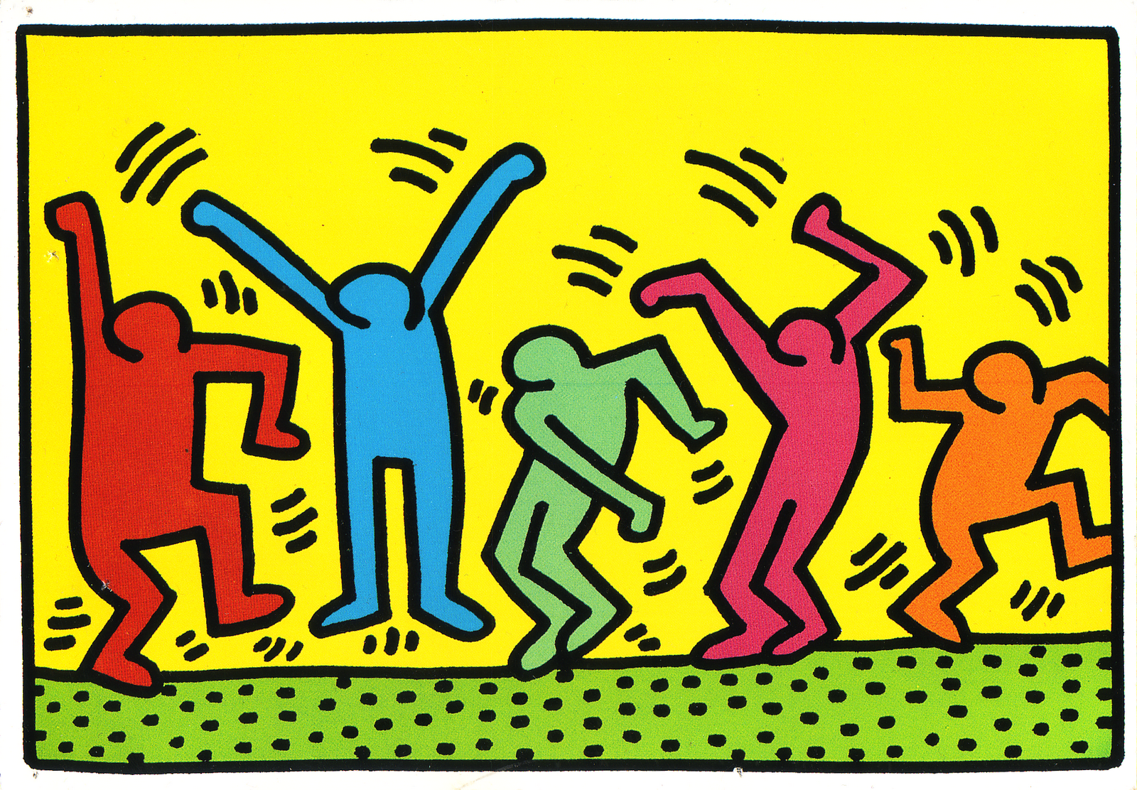

I was very fond of Keith Haring and felt he would be influential in my sports results infographic as I could take his figurines he designed and form them into actions that represent each sport. I would like to try this and see how they turn out.

Along with researching Keith Haring, I looked at the London 2012 Olympics logos for every sport that was taking place. The main aim from this was to analyse how the designers have managed to portray a certain sport in a simplistic image.

I found the Change 4 Life campaign to be a huge influence in thinking of ideas for my infographic. With the sports results especially, most of them were activities people could easily get into and linked highly with the healthy campaign. From that, I felt I could imitate similar drawings on Illustrator. I am going to be combining the style of Keith Haring and Change 4 Life into my sports results infographic.

Taking inspiration from Keith Haring, the Olympic logos and the Change 4 Life campaign, I decided to create figurines that represent the sport and have the data at the bottom. For me, this has been a massive improvement from the previous thumbnail and would love to add some colour. So far, this is my favourite design.

After adding some colour, I am sold on this design. It is bright, colourful and stands out on the page. I think this has been a unique and creative way of displaying results that can appeal to a wide audience (young and old). However, after a discussion with my tutor, improvements can be made. For instance, the way the text is positioned now is not on par with the visuals. Also, I might put them on two rows as they can be larger and have more room to breathe.

Taking on the tips by my tutor, I implemented them onto the thumbnail. I have now placed the data into the chest of the figurines and being on two rows allows more room for them to be seen clearly. I am much happier with these designs and am confident in creating this on Illustrator.

I did attempt the text layout thumbnail I drew as I liked the potential of this design. After trying out various colours and fonts, I am not fully pleased with this. I think it was going to take a lot longer to complete than I originally thought and having already completed some work on my sports results infographic, I am much preferring that design so far. Therefore, I am not going to spend any more time working on this layout as I want to prioritise completing the sports results design.

This was my first attempt at my sports infographic. I am very pleased with the figurines I drew on Illustrator as they are energetic and appear like they are moving. This makes my infographic lively and enthusiastic.
At the same time, I did not include the motorsport result as it would have ruined the size of the drawings as having 5 on a line would have meant needing to reduce the size of them. Also, it is not a sport that everyone can get into easily due to cost. The sports that were mentioned funnily enough were activities people could participate in without too much difficulty (linking in with the Change 4 Life campaign of keeping fit). Therefore, I decided not to include the motorsport result. As well as this, I am still unsure on the position of the text. I attempted placing the results on the drawings but not all of them lined up right and it was not a design I would be satisfied with. I am going to try a different position of the text.

I moved the results onto the same line with the title of the sports. It is a slight improvement but I am finding the colour of the text too bland and are not contributing to the excitement of the infographic. I am going to try a different design that is completely different to the previous ones.

I decided to convey the figurines into bar charts to help display my results. It was a good idea in my head but when transmitting that onto Illustrator it did not come out as well as I hoped. I realised I could not fit all the results onto the chart, the various sizes of them did not look good and they were still too close together despite my best efforts. Even though it has not worked, I am pleased I attempted it. In terms of moving forward, I might go back to a previous design and try to develop that further.

Out of the three designs I did on Illustrator, I was most satisfied with the second one so I developed that further. For starters, I changed the font as I did not like the previous one. I much prefer the new font as it is clearer and neater. I also changed the colour of the results as this broke up the black text that was diminishing the vibrancy of the infographic. However, to complete this, I had to change the colour of the hockey player as the light green did not show well on a yellow background. The dark blue works much better. Finally, I included a line in the middle to help break up the overpowering yellow background. Overall, I am much happier with this design as it shows my results in an entertaining way with bright colours and fun characters. I also feel this infographic can appeal to a wide audience and links highly with the artist Keith Haring and the Change 4 Life campaign. I am very pleased with the final result.
Overall, I enjoyed this project a lot more than I thought I would and has been good experience for future projects. This is the last 4 week project to do and I will be starting 2 new projects when I come back to uni after reading week. However, I shall be attending the 4 Designers conference in London first which I am looking forward to a lot. It shall be great to hear from designers that are in the industry!
Mike
References:
Information is Beautiful - David McCandless
Keith Haring - http://sarahelizabethellis.blogspot.co.uk/2011/06/keith-haring-takeover.html, http://www.popmatters.com/column/warhol-jr/
London 2012 Olympics - http://www.telegraph.co.uk/sport/olympics/london-2012/6346568/Olympic-logos-unveiled.html
Change 4 Life - http://costcutter.co.uk/food-and-drink/change-4-life.aspx, http://www.nhs.uk/change4life/Pages/be-more-active.aspx


